

Everyone with eyes in the United States has seen this picture at some point in the last few months.
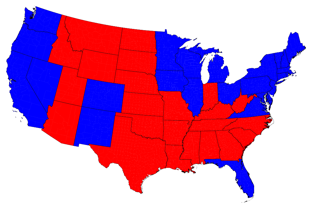 The problem with that image is that the surface area of red way over represents the Republican support in the country.
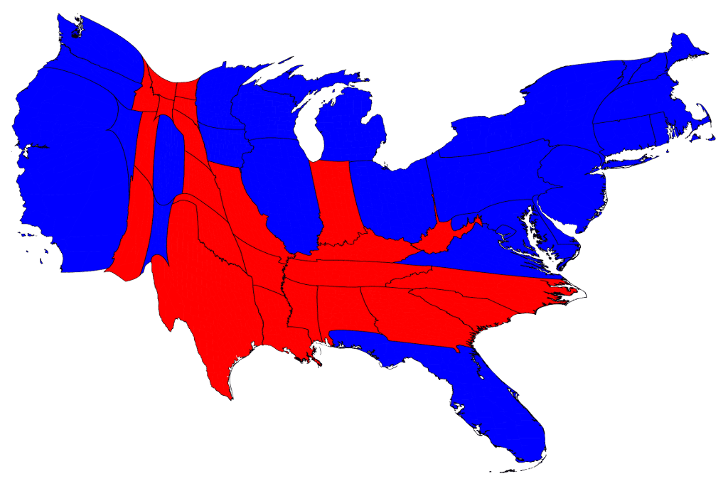
A more accurate map (based in population) would look more like this:
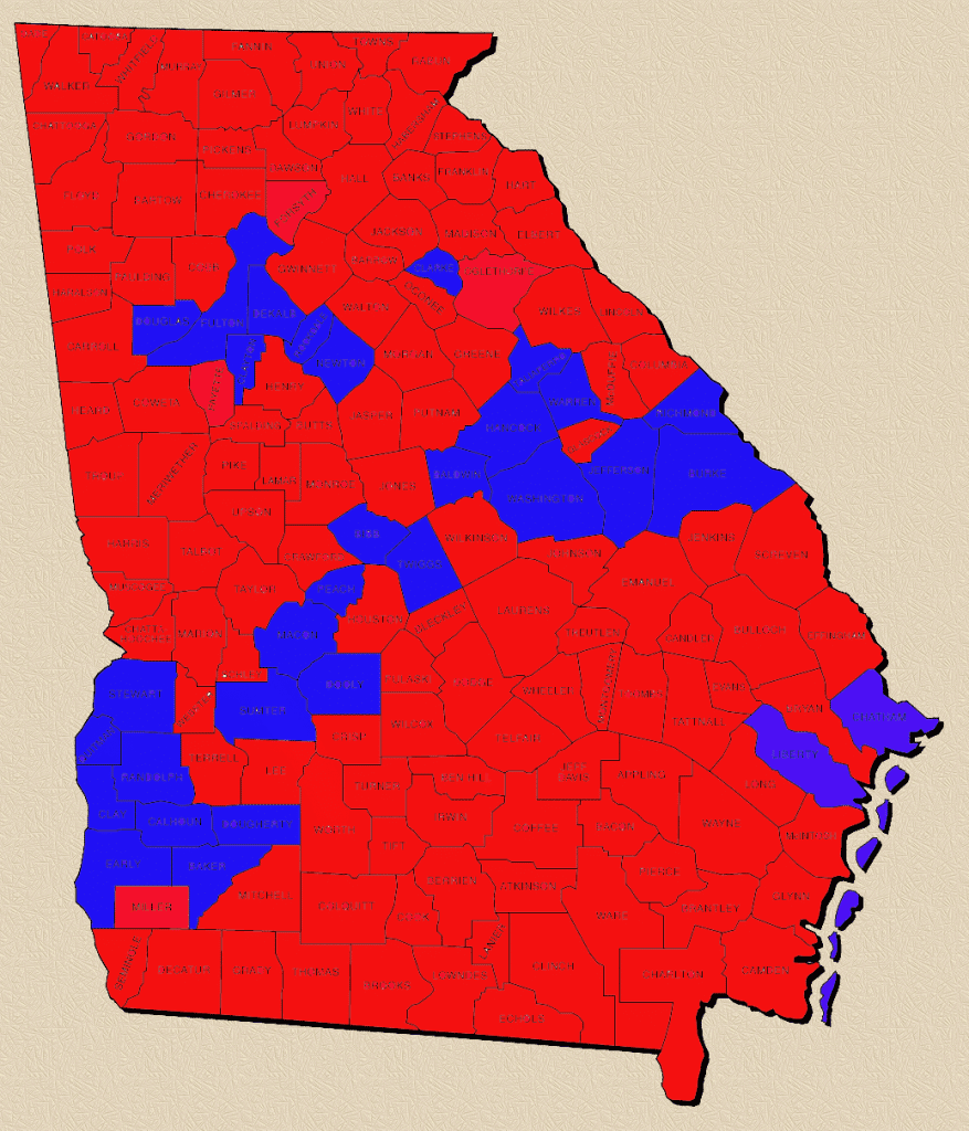
The same is true of the state of Georgia. This county by county map makes it look like Republicans have a huge majority over Democrats in the state.
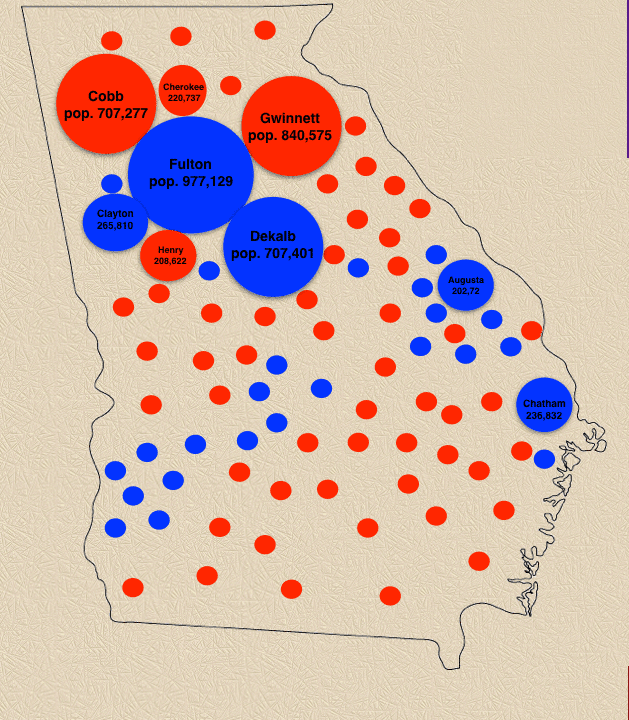
A more accurate map might look something like this, with counties that have populations over 200,000 taking up space on the map.
By: Daniel Jackson
Follow us on Facebook, Twitter, and Instagram @GradyNewsource