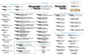
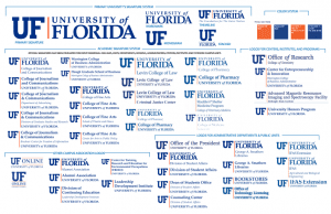
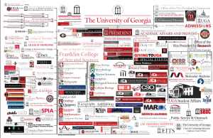
Georgia Tech. University of Florida. Two of the biggest rivals of The University of Georgia.
We’re talking about this because one area where both schools beat the Bulldawgs is at having an aligned identity. That means that the logos for the different departments in the University of Georgia, are all over the place. They each have a very different look.
UGA’s Marketing and Branding Department wants to change that by re-aligning the University’s logo system. They have been hosting a series of Visual Identity Listening Sessions in March and their last meeting was this morning at 9:30AM. The purpose of these meetings is to allow faculty, staff, students and alumni to discuss establishing an institutional system for logos. UGA Marketing and Branding Department Senior Graphic designer, Janet Beckley believes the University has a lot to offer visually. ” The University has wonderful stories to tell and they need to kind of be told visually, beyond the borders of Georgia and I think having a visual identity system that is consistent across the board will help” says Beckley.
You can see the scrambled mess of UGA logos compared to the very clear across the board image from GT and UF.
Another big factor in why UGA is exploring the logo re-alignment now, is because the original logo was designed in 1988. Social media and technology have since advanced and the University wants to align in order to refresh the logo system to better meet the needs of the University and evolve its visual identity across these social media platforms.


